Matplotlib
Matplotlib的简单使用, 官方example🔗多查多看
写在前面
本贴主要从基础概念上进行讲解,具体的实例展示将在新帖展开。
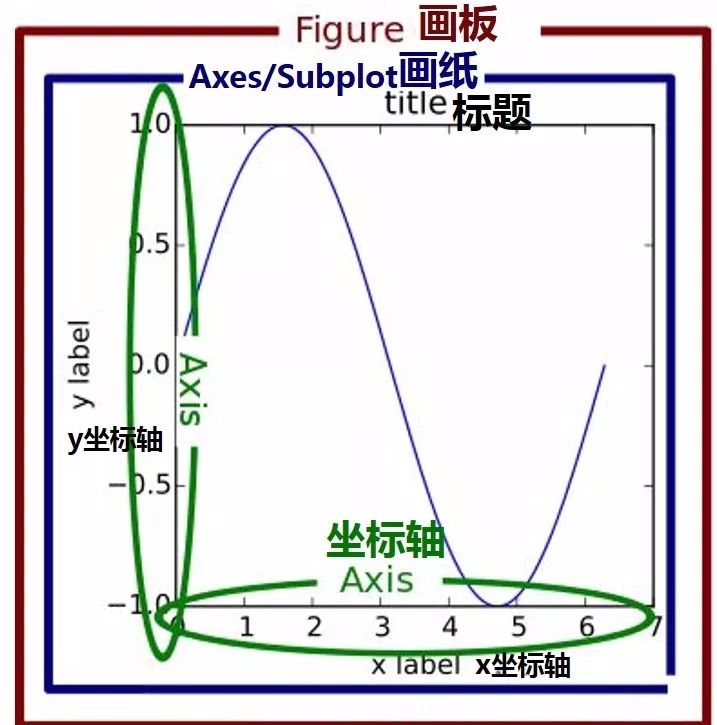
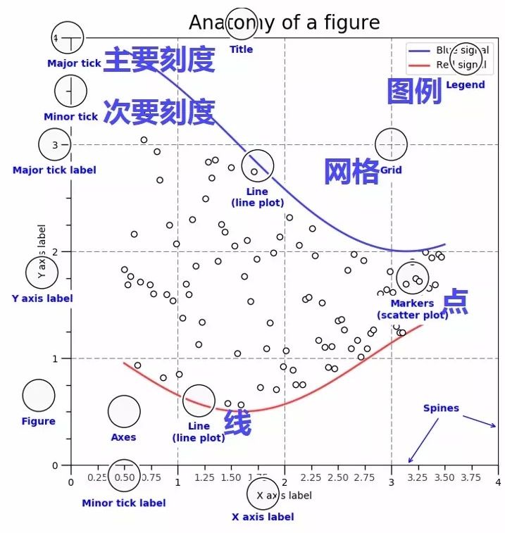
- 画板figure
- 画纸上最上方是标题title,用来给图形起名字
- 坐标轴Axis,横轴叫x坐标轴label,纵轴叫y坐标轴ylabel
- 图例Legend 代表图形里的内容
- 网格Grid,图形中的虚线,True显示网格
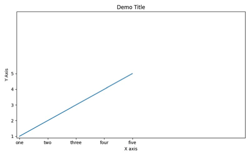
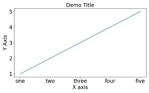
两个图帮助理解:
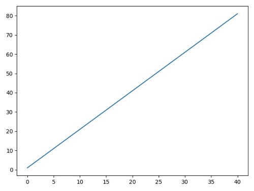
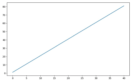
接下来从一个简单的折线图开始增加/修改元素
1 | import matplotlib.pyplot as plt |
画布操作
设置画布尺寸
1 | import matplotlib.pyplot as plt |
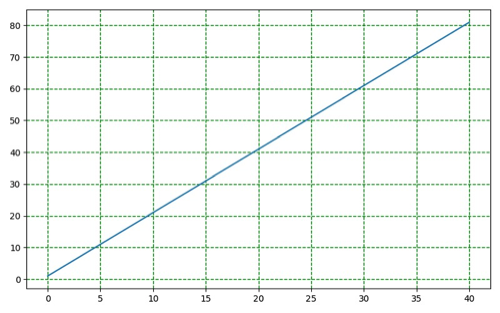
增加背景表格
1 | import matplotlib.pyplot as plt |
坐标轴操作
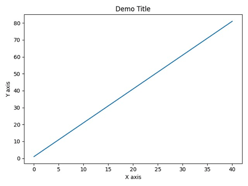
设置x & y轴文本, 标题
1 | import matplotlib.pyplot as plt |
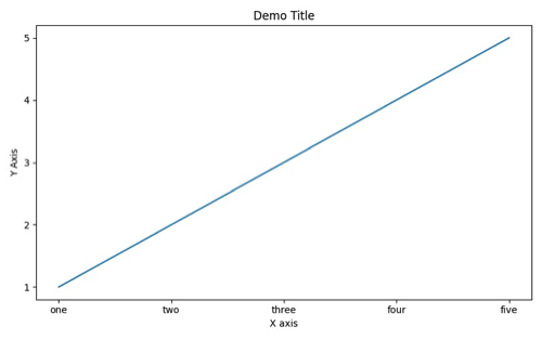
更改X & Y轴坐标值
1 | import matplotlib.pyplot as plt |
更改X & Y轴坐标范围
1 | import matplotlib.pyplot as plt |
更改字体大小
1 | import matplotlib.pyplot as plt |
线条操作
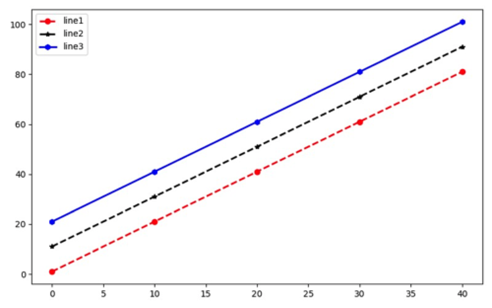
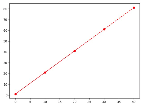
修改线条格式
1 | ''' |
legend
添加基本legend
1 | import matplotlib.pyplot as plt |